Mileage report
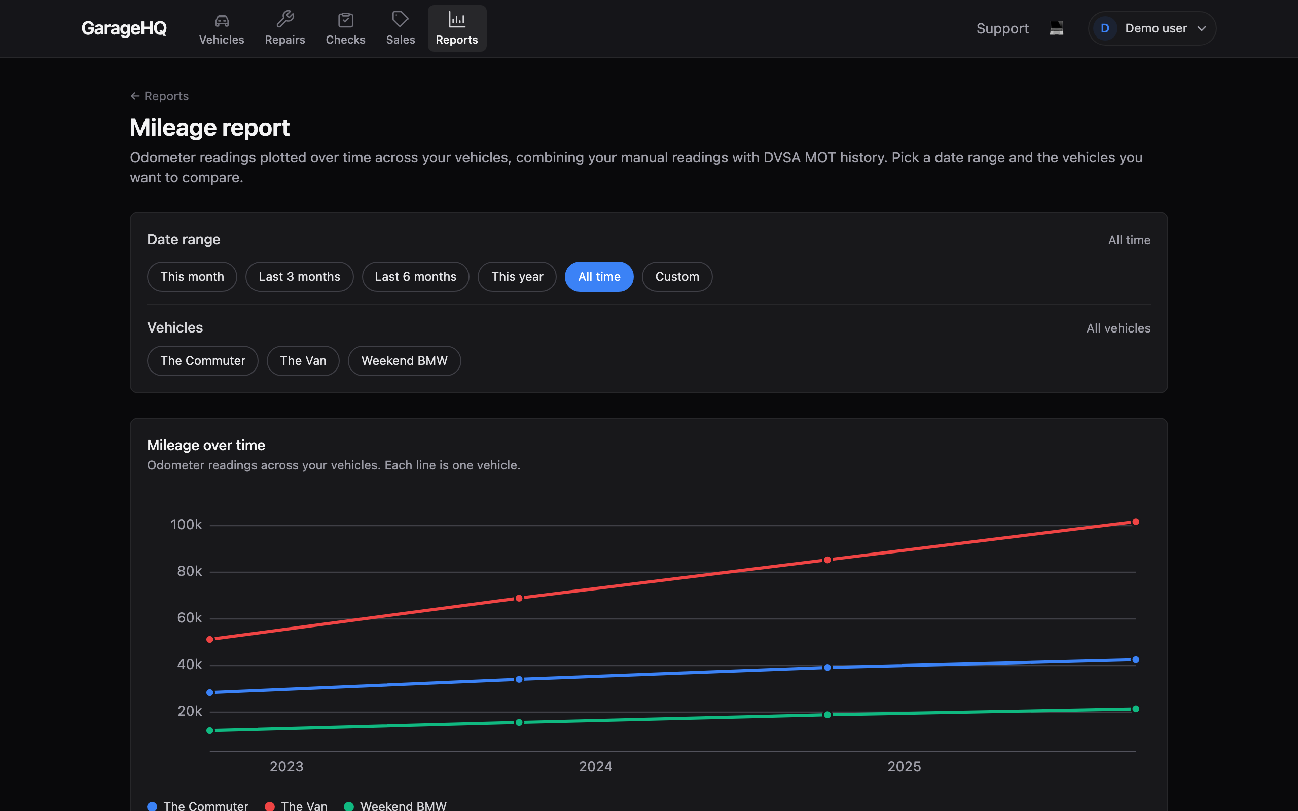
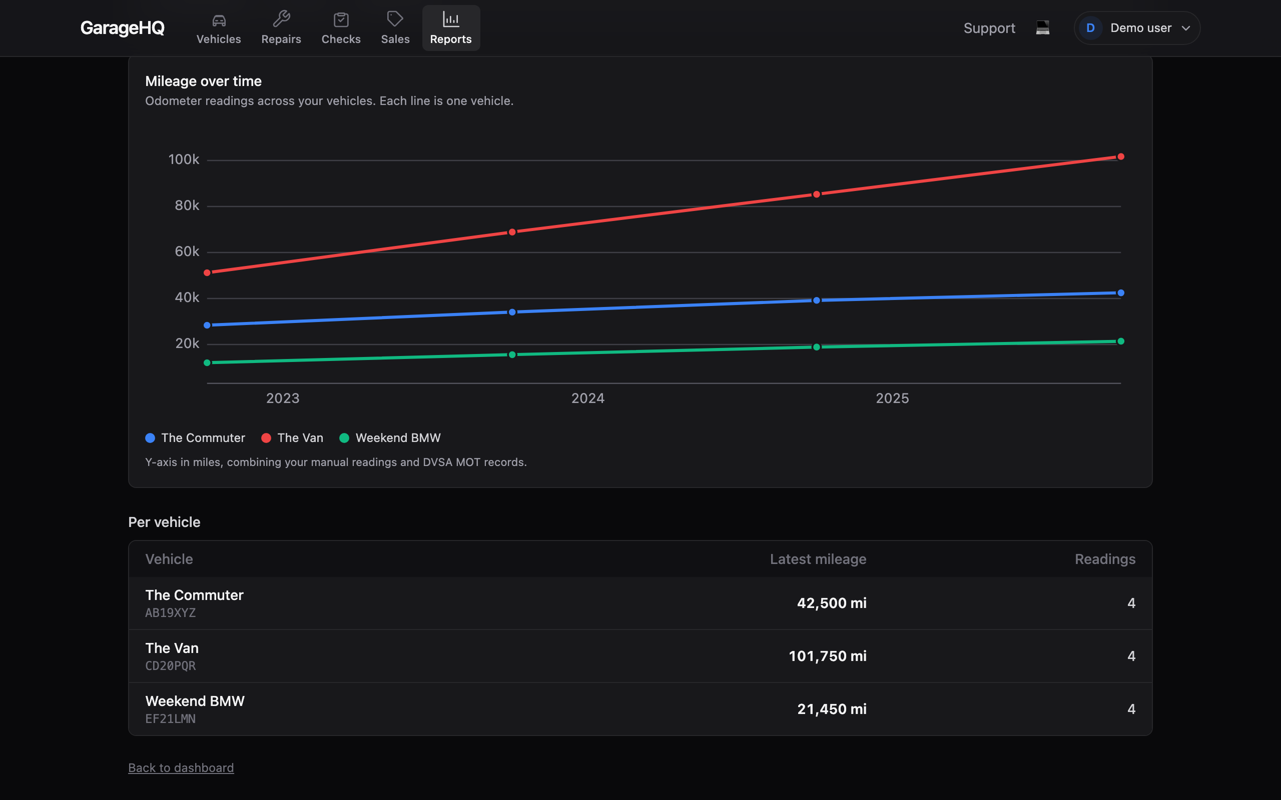
The mileage report plots how far your vehicles have travelled over time, one line per vehicle on a single chart, so you can compare them at a glance and see the total mileage on each.
It pulls from two sources automatically: the mileage you log yourself and the odometer readings recorded at each MOT. Readings in kilometres are converted to miles so every line is on the same scale.
1. Choose the vehicles to compare
By default every vehicle you can see is included. Use the vehicle picker to narrow it to the ones you want to compare, click a vehicle to toggle it in or out, and Clear to go back to all.
2. Set the date range
Use the date-range selector to focus on a period (last year, a custom window, or all time). The chart and the per-vehicle totals update to match.
3. Read the chart
The horizontal axis is time and the vertical axis is the odometer reading. A steeper line means more miles covered in that period; a flat stretch means the vehicle sat unused. Hover or focus a point to see the exact date and reading.
Below the chart, each selected vehicle shows its total mileage (the most recent odometer reading on record) and how many readings it is built from.
Where the readings come from
- Your mileage log: anything you record on a vehicle's page (see Service history and mileage).
- MOT odometer readings: captured from DVSA each time you view a vehicle's MOT history (see MOT history).
A vehicle with fewer than two readings cannot show a trend line yet, log a couple of readings or open its MOT history to populate it.
What next?
- Tracking vehicle costs for the cost side of the same vehicles.
- Service history and mileage to add your own readings.
- MOT history to pull odometer readings from DVSA.